abt the customization

this goes for all three features btw (themes, cards, & profile pages)
what ive noticed is that the color picker is REALLY sensitive. like.. i literally have to balance on the edge of stuff just so im able to have something i kind of like.
i understand the restriction is to ensure people are able to read whats being said, but.. it just seems a bit touchy.
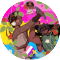
the image below, for example. im not allowed to use this despite it being readable (in my opinion), because the background and texts contrast is "too low" whatever that means.
i really dont get it, considering its clear for me and other users to read. yes, people may have sight problems, but this seems pretty odd to me.
sorry if im acting really pressed about this, i just REALLY enjoy customizing and decorating stuff, and the amount of space i have is ticking me off.

Replies 0