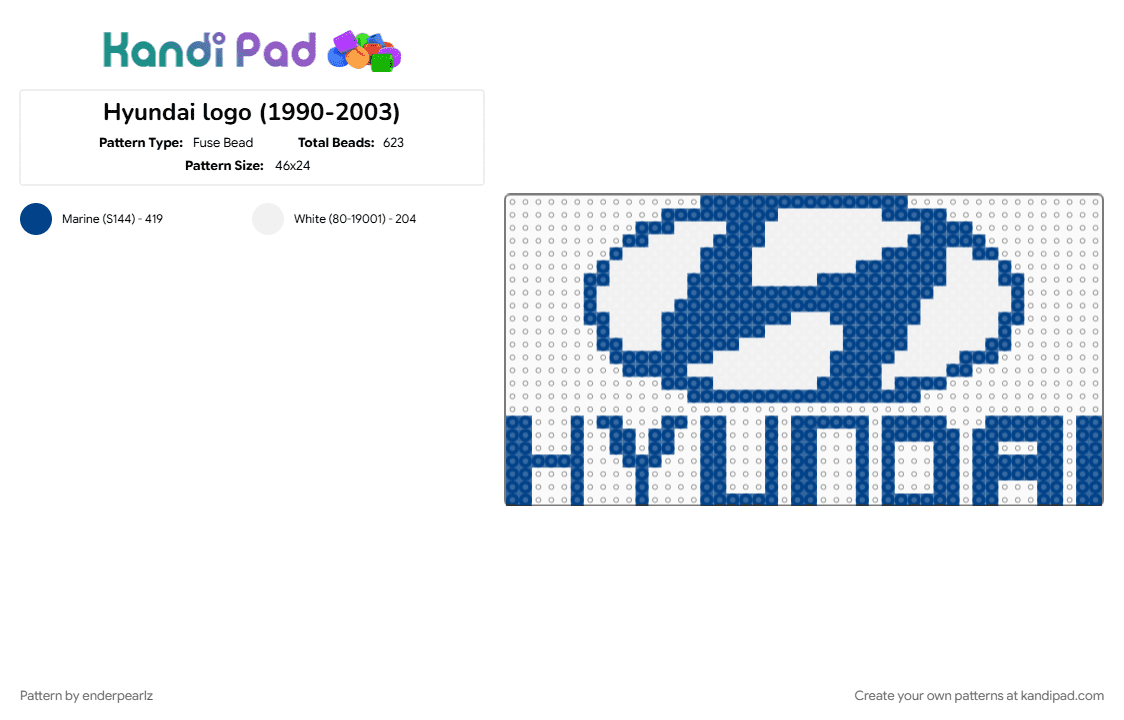

Hyundai logo (1990-2003)
The 1990–2003 Hyundai logo marks the official birth of the South Korean automaker’s global corporate identity, stepping away from the generic geometric shapes of its past to debut the stylized, slanted "H" emblem we recognize today. Introduced to spearhead Hyundai's aggressive international expansion, the logo features an italicized, forward-leaning letter enclosed within a perfect ellipse. While it easily reads as the brand’s first initial, the design holds a famous hidden meaning: it is an stylized abstract drawing of two people shaking hands—specifically representing a company salesman and a satisfied customer building a foundation of trust. The forward tilt of the entire graphic was deliberately calculated to symbolize progress, momentum, and an optimistic look toward the future. Finished in a stark, high-contrast palette of deep navy blue and crisp white, this definitive emblem proudly branded the hoods of breakout 1990s models like the Elantra, Sonata, and Tiburon, laying the crucial groundwork before the symbol was given a metallic, three-dimensional makeover in the early 2000s.
Log In or Sign Up to comment on this pattern.