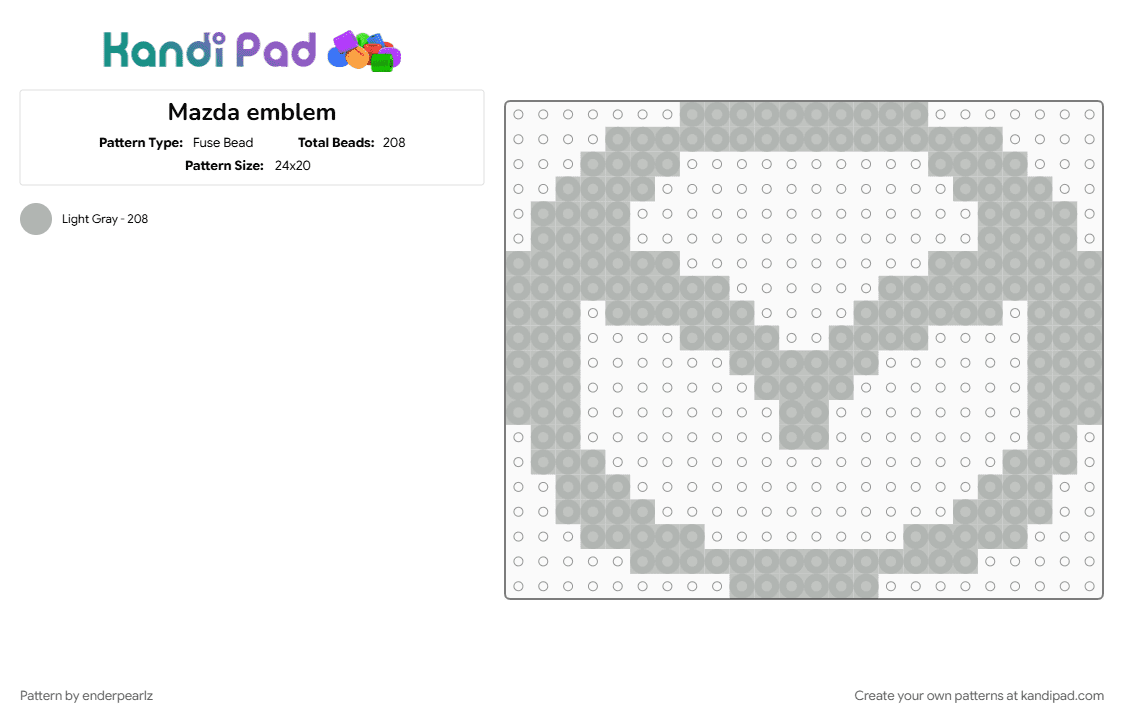

Mazda emblem
The company's name honors both its founder, Jujiro Matsuda, and Ahura Mazda, the ancient Zoroastrian god of light, wisdom, and harmony. In its earliest days during the 1930s, the Japanese brand utilized a triple-stacked "M" emblem framed by outstretched wings. This design pulling triple duty, symbolizing "Mazda Motor Manufacturer," nodding to the flowing rivers of its hometown of Hiroshima, and expressing an innate desire for agility and speed. As the brand pivoted into passenger cars and global exports, the logo shifted dramatically. By the 1960s, it transformed into a minimalistic lowercase "m" encapsulated by a sleek circle. This layout briefly evolved in the early 1990s into a striking, hollow geometric diamond meant to signify a sun and an eternal flame, subtly paying tribute to Mazda's world-famous rotary engine technology. The definitive emblem we recognize today was born in 1997, crafted by designer Rei Yoshimara. Featuring a sharp, V-shaped form stretched elegantly inside an oval, the design acts as an abstract letter "M" while simultaneously depicting a pair of soaring wings in mid-flight. It perfectly communicates creative thinking, flexible motion, and an unyielding commitment to continuous brand growth. Following years of metallic chrome refinements on physical vehicle grilles, Mazda seamlessly transitioned this iconic winged symbol into a flattened, ultra-clean monochrome design optimized for the modern digital era.



























Log In or Sign Up to comment on this pattern.