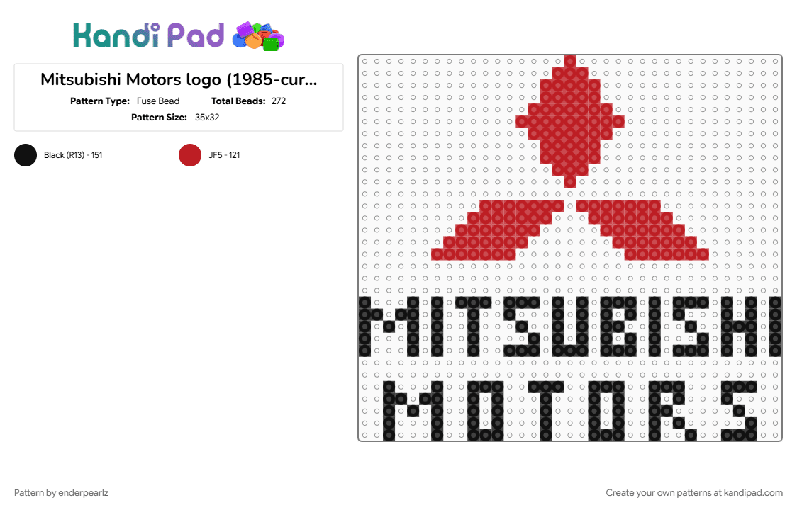
Mitsubishi Motors logo (1985-current)
The 1985 to current Mitsubishi logo represents the definitive, modern consolidation of one of the oldest and most geographically stable visual identities in the automotive world. The core emblem—featuring three bright red diamonds meeting at a central point—actually dates back to the 1870s, created by brand founder Yataro Iwasaki by blending his family's three-layered rhombus crest with the three oak leaves of the Tosa Clan. In 1985, Mitsubishi launched a major corporate identity campaign to standardize this ancient emblem for the rapidly growing global market. While the geometric proportion of the red diamonds remained untouched from a 1964 refinement, 1985 introduced the clean, bold corporate wordmark directly beneath the symbol. Written in a structured, masculine, all-caps sans-serif typeface, the black text anchors the energetic red graphic, projecting a modern message of strength, authority, and industrial expertise. An interesting quirk of this era occurred in its home market of Japan, where the company actually adopted a stylized "Blue Mitsubishi" wordmark for its electronics division to create domestic individuality, while keeping the classic red triangles active overseas. By 2014, the company officially retired the blue variation, permanently unifying the classic red three-diamond logo across all global products, automotive lineups, and digital platforms. Conceptually, the emblem's three nodes continue to stand for the brand’s core pillars: reliability, integrity, and success



























Log In or Sign Up to comment on this pattern.