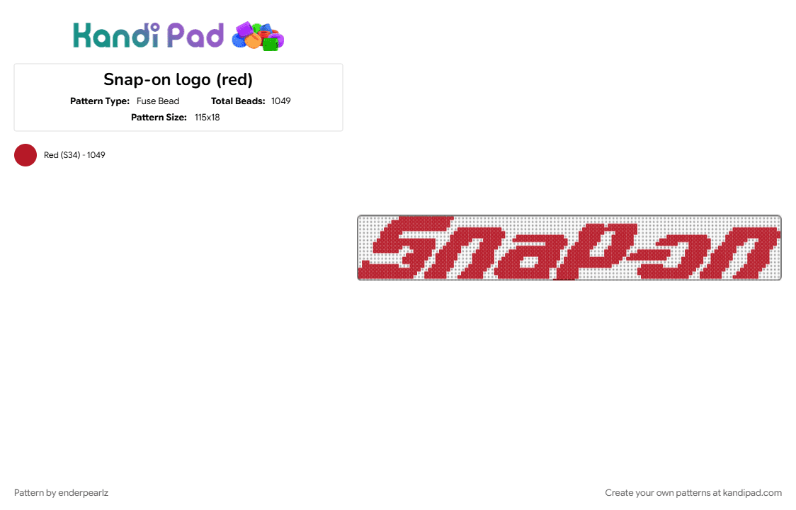
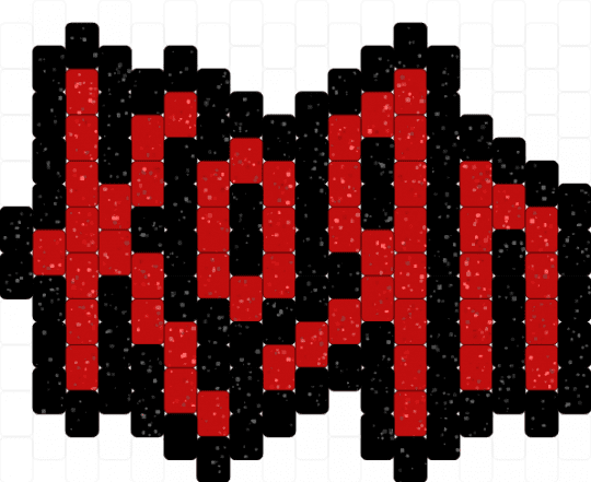
Snap-on logo (red)
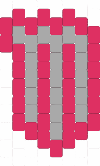
I'm making this for my Dad for Christmas hehe. The 1995 to current Snap-on logo stands as the definitive, longest-running symbol of the legendary American tool manufacturer. Designed by Thiel Design and launched in 1995, this modern iteration revitalized the brand's identity by moving away from a strict rectangular frame to a more open, dynamic layout. The core of the design features bold, heavy typography where the lowercase letters fluidly connect to symbolize strength and seamless performance. A signature element carried over from previous generations is the clever wrench-shaped cutout hidden inside the negative space of the capital letter "S," a direct nod to the company's tool-making heritage. Additionally, the lowercase letter "o" is crafted to subtly resemble a modern power button or a specialized socket graphic. Finished in a striking palette of high-contrast red, silver, or black, this emblem has spent over three decades laser-etched onto premium wrenches, stamped across heavy-duty rolling toolboxes, and proudly displayed on the sides of the brand's iconic mobile showroom trucks globally.























Log In or Sign Up to comment on this pattern.