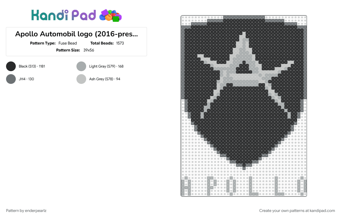

Apollo Automobil logo (2016-present)
Request from ScrapsFict0nkin! The 2016–present Apollo Automobil logo signifies a fierce, hyper-futuristic rebirth for the German hypercar manufacturer. Originating as Gumpert Sportwagenmanufaktur in 2004—which famously used a round, gold-and-red crest featuring a mythical griffin—the brand overhauled its visual identity entirely following a 2016 corporate restructuring and acquisition. The modern badge completely abandons its predecessor's layout, opting instead for a significantly narrower, sharper silver-framed crest. At its center sits an aggressive, deeply geometric, and highly stylized letter "A" executed with a distinct three-dimensional metallic effect. The vertical bars of the central letter are sculpted to mirror razor-sharp sword blades, projecting a sense of raw power, danger, and uncompromising engineering performance. While the primary corporate emblem utilizes a sleek, matte black background fill within the shield, a more aggressive variant features a gradient fiery orange-and-red bottom designed to look like a roaring flame. This minimalist yet high-intensity crest serves as the perfect visual anchor for the brand's wildly sculpted, extreme multi-million dollar hypercars, like the Intensa Emozione (IE) and the Project EVO.
































Log In or Sign Up to comment on this pattern.